Showing posts with label process. Show all posts

June 6, 2015

Logo Process: "Business Stuff"

Now that I've walked you through the design process (see my previous post), I'm guessing the little accountant in you still wants to know the bottom line: how much does it cost? This post will be dedicated to dotting the "i"s and crossing the "t"s: fees, payment schedule, contracts, and legal obligations. (I know, they're my least favorite part, too.)

Cost / Fees


Invariably, the first thing a prospective client wants to know is what a logo will cost. Regardless of the quality of the product, churches (and businesses) operate on limited budgets. I get that, which is why I try to keep my prices very reasonable. Your average country parish probably doesn't have a large slice of disposable income. On the other hand, neither do I, so I have to balance my client's needs against my own.

I don't have a flat fee for logo work. That may frustrate those who want a "bottom line" figure up front, but if you think about it, it makes perfect sense. You wouldn't expect a roofer to charge the same fee to re-shingle your house as he would to re-shingle the local country club. There is a formula to it (although not necessarily a rigid one). I try to gauge the size of my client, how much work the project will take, supply and demand, range of usage, turnaround time, and other factors.

Unused logo that incorporated the shape of the church's windows.

Oh boy, here it comes. He's going to start throwing around huge numbers, talking himself up, and eventually we'll be convinced that if we don't commission him, we'll be losing money! I can just hear it now, "Only ten low payments of $199.99!"

If you do your research, you'll find designers who will make a logo for anywhere between $200 and $10,000. Some designers charge hourly, and their rates can range between $70 and $150 an hour. I chose not to charge by the hour, because judging from the amount of time I invest (roughly anywhere from 15-30 hours), it would probably make the product unaffordable for most of my prospective clients. (That being said, I reserve the right to charge more if the client requests an unreasonable number of changes. It hasn't happened yet, but it's a possibility.)

See? I told you. Smoke and mirrors. So just answer the question already.

The absolute lowest I currently charge is $500. (That would likely be for a small church with, say, less than 100 parishioners.) I consider that to be a reasonable price for the amount of support I provide, the number of designs you get to choose from, the level of input you get, virtually unlimited changes, and so on. Best of all, if you're a Lutheran church, I already know more about you than just about any designer you'll be able to find. 

Oh, I guess that's not so bad...

But wait! If you call now... just kidding.

By the way, if you're happening across this page by accident, I don't design only for Lutherans—or only for churches. I'm happy to work for any paying client. I just don't do pro bono work, because I can't eat that.

Payment Schedule


As soon as I get a clear description of what the client wants, I draw up a project agreement detailing what rights will be transferred (more on that later), what the fee will be, timeline and due dates, etc. I sign it and mail it off to be signed and returned by the other party.

The first payment is a deposit, usually 10% or $100, nonrefundable, which I require before beginning work. That just ensures that any preliminary work I do is compensated for if the client withdraws from the project. (This hasn't happened yet for graphic design work, but I have put significant hours and mileage into a liturgical project and gotten nothing for it.) But the deposit counts toward the total fee—so it isn't in addition to the fee.


The balance is due within 15 days of completing the project. So the total fee, plus any additional expenses (e.g. font licenses), plus additional fees (for extra logo treatments, seal design, etc.), minus the deposit. Based on my current rates, your total "out-the-door" expense is usually less than $800.

Copyright & Legal Stuff


So whose design is it, anyway? And what can we do with it?

A full copyright buyout is typically expensive, so I retain the copyright to the design. However, the client receives exclusive reproduction rights, with no limitations on medium, duration, or number of uses. So for all intents and purposes, the design is yours. Once the contract has been signed and I've received full payment, you have the rights to use it however you like, within loosely defined identity guidelines. I reserve the right to display the logo on my website and in my portfolio. But I cannot sell the design to anyone else—so you have the assurance that no one else will be using it. (If they are, let me know, because they're infringing on copyright.)

As to what you can do with it, you can reproduce it in any medium you desire: print ads, bulletins, banners, video ads, t-shirts, mugs, or macaroni noodles. What you can't do is alter the design. If at any point you want to make changes to the logo, I include a clause in the contract that requires you give me first choice to make changes (for an additional fee). If I decline, you may take it to a different designer. If you want a totally new design, you're of course free to commission any artist at any time.

How long does it remain ours?

The rights remain yours for as long as you continue to use it—whatever length of time that may be. If you cease using it (for instance, if you design a completely new logo), then the rights return to me.

Can we print the logo on tie-dyed shirts and outline it with sequins?

Most likely, no. Artists have the right to determine how their work is displayed. I include a brief set of identity guidelines to ensure that your logo is displayed consistently and professionally. This helps to establish your "brand" or visual identity. So unless part of your permanent identity is tie-dye and sequins, and unless the original logo design took that into account, it is very probable that I wouldn't allow your logo to be displayed in such an unflattering way.

Okay, but what if we don't like the final design?

I can't stress enough that this is incredibly rare and highly unlikely. It's never happened to me. If you don't like it, it obviously isn't "final"—and I will keep working on it. But if for any reason the client and I reach an impasse, there is an industry term known as a "kill fee." The fee varies depending on the level of work already done. The kill fee is usually between 50-100% of the original fee. Because a family's gotta eat. (You usually don't get to keep your money if you don't like the plumber's work.) Upon termination of a project, the kill fee is due, but none of the rights are transferred to the client.

The reason this is unlikely is that as much as I need the money, having a good reputation with my clients is equally important—if not more so. I've received most of my business by word of mouth, and having an upset client who just shelled out a bunch of money for a design they don't want is not worth it. So I will go to any lengths to find a design you'll be satisfied with.

If you're still not convinced, feel free to read through my previous post that covers the design process from start to finish. There's a lot of push-and-pull from client interaction, and I credit that dynamic for several of my most successful designs.

Conclusion


In short, there's a lot of legal mumbo-jumbo. But I make sure that I communicate to the client exactly what they are getting. Good communication is key to a good logo design and a satisfied customer, and so far, I've only had satisfied customers.


Did I miss anything? Leave a comment or question and I'll answer it in a follow-up.

June 5, 2015

Logo Process: Start to Finish

Until I find a wealthy Lutheran Pope to keep me busy with liturgical art until age 94, I'm happy to say that God provides other means of income. Graphic design—church logos in particular—have become my bread and butter of late. This surprised me, because in college I often thought of graphic design as a "lesser" art form, grouped down there with advertising, typesetting, and commercial stuff with little creative value. But since then I've had to diversify my interests, and I found ways to advance professionally in fine art, illustration, and graphic design.

A lot of folks are curious how I go about designing logos. It's a scary step for some people—making  a commitment to buy a product that you won't see until it's finished. They want to know how much control they'll have, and if they will like the result. A logo says a lot about you. It can powerfully proclaim what you believe and teach. Or it can say, "I paid my cousin $20 to draw this in Microsoft Paint." And whatever it says, you're stuck with it—at least until you can find someone better to fix it.

So hopefully I can remove some of the mystery and anxiety from that process. As an example, I'll use my most recently completed commission for Immanuel Lutheran School in Roswell, New Mexico.

The Brief


I had little to go on to begin the design work. Some clients prefer it that way; they don't want to show me what they had before, because it might prejudice me toward a certain idea that they might be tired of. (They want something completely new, not just a rehashing of an old design.) But in this case, the school wanted to retain a nod to the original design, which was a paschal candle.

The client gave me a few keywords to focus on: baptism, Christ crucified, classical education, vocation, catechesis; and their motto, "In Veritate Lux Vitae" (In Truth is the Light of Life). Most of these are abstract ideas that are difficult to visualize. But I promised to keep them in mind. If the client feels like I'm not meeting their needs, no amount of artistic polish is probably going to satisfy.

Step 1: Idea Generation


Whenever I begin work on a logo, I start on paper, in my sketchbook. It's the fastest way to get ideas out of my head. Sometimes there's nothing there worth keeping, but the point isn't to create "keepers." In idea generation, "bad" ideas are just as useful as good ones. It's more about developing the muscle of your brain to do hurdles. The best idea is never your first idea, so the more ideas you can spill out of your head, the more likely you are to end up with a great one... eventually. The more often you do this, the easier and faster the good ideas come. 


In all likelihood, the client won't see any of this. Because when I send the first "sketches" to the client, I'd like them to be in the same medium as the final product. They probably can't look at my scribbling and see a shiny vector drawing in their minds' eye. So when I've got at least a dozen or more ideas on paper, then I go to Illustrator and start sketching.

Step 2: Sketching


I call it sketching, because even though I draw up the designs with clean vectors, they aren't anywhere near being complete. They're still just a half step beyond idea generation. Every medium has its advantages. I can sketch very quickly on paper, but Illustrator lets me duplicate, edit, rotate, and translate shapes. Sometimes, just "playing around" in this way can result in accidental shapes that suggest something I hadn't thought of before. Again, it doesn't always produce anything worthwhile. In this case, there's a lot of junk. But if nothing else, it gives the client inklings of what they do and do not want.


I began working in two colors, black and gold. (I thought these were the school's colors, but it turns out the photograph of the embroidered logo above made the navy blue look black. I color corrected it afterwards for your benefit.) Some of the designs were keyed more toward the New Mexico flag and its cultural heritage. Like I said, even bad ideas are helpful at this stage. The school headmaster communicated to me the leanings of the school board in terms of which designs they liked and which they didn't. So I went back to the drawing board for round 2.


The second round of designs included numbers 1, 4, and 9 from the first round (now labeled A, B, and C). The black was corrected to blue, basic type treatments were added for context, and other minor adjustments were made. I also threw in a design I happened upon later (D), hoping it might have some of the qualities they wanted.

In round 2 discussion, the board was leaning towards design C. Option C was working the best as a design, but I wasn't sold on it—the similarities to the CPH logo were getting stronger the more I worked on it. So I went back to "play" mode in Illustrator, starting from scratch but trying to keep in mind the things they liked about option C. I mulled over the world "Immanuel," trying to figure out what impressed me most about the name. Immanuel means "God with us." How could I show that?


Although it seemed obvious from the beginning, I had initially dismissed the idea of a manger, because what school would want to use a "Christmas" logo all year round? But perhaps abstracted, it wouldn't seem so Christmassy. I drew a manger in flattened perspective, and when I squeezed the sides together so that the legs of the manger overlapped, it resulted in a very nice abstraction and repeated triangle motif. I wanted to get Christ, or a cross, back into the design, too. So I placed a nimbus over the manger, and lo and behold, it also created a chalice and host. The manger also created a nice downard-pointing arrow, which reinforced the God-to-us concept. I immediately loved the idea, and hoped the school board would, too. I created designs E and F to submit along with the other round 2 options they were already considering. F included a stable, or possibly a school, as a containing shape instead of the open Bible.

Step 3: Finessing


There were some positive reactions to E and F, and some who still liked B and C. Discussion continued for a few weeks, during which time I had to just sit back and let it run its course. If I had kept sketching or brainstorming, or introduced new designs at that point, it would have just set the discussion back.

At some point, the headmaster asked if the Paschal candle or flame could be reintroduced to the E and F designs. I initially balked at the idea, knowing that including a candle would mean something else would have to go—most likely the cross/nimbus. But trying to keep and open mind, and not wanting to disappoint, I tried it. I ended up liking the result more than I thought I would. The eucharistic symbolism was lost, but for the purposes of a school, it was more important to keep the motto and "teaching" aspect in mind.


The school board finally settled on E2, but said that they preferred the type arrangement from F2. A clean, sans-serif font like Futura would compliment the geometric simplicity of the logo, but it also says "modern!" when Lutheran schools typically want to proclaim "tradition!" So I began the search for a serifed font that would still look sufficiently angular to match the aesthetic of the logo.

Step 4: Typography


I try to avoid easily recognizable fonts, even if they might have the right characteristics. Futura, Copperplate, Arial, Trajan, etc. are too familiar and can carry bad associations, especially to typography snobs. (I'm slowly becoming one.) Which means that finding the right font means looking outside your own library.

In one sense, I hate this part. I hate it because you really have to know what you're looking for. If you don't, you'll spend hours scrolling through fonts until your eyes are bloodshot and your head is pounding from focusing so intently on the screen. My favorite tool is FontSpring.com. I don't even bother with the free font sites, because you have to page through too many Homer Simpson fonts to find the gems—and even then, they're gems in the rough. They might not have full character support, or ligatures, or maybe they don't look as clean at 80pt as they did at 18pt. So I go to the professional font foundries. They have better fonts and better tools for finding fonts (e.g., keywords and dozens of specifically defined categories). Sure, you might have to pay $50 for a font license, but the perfect font is well worth it.

I used the "preview text" tool in FontSpring to enter "Immanuel," then took a screen capture of the result in order to preview it with the logo. No sense paying for a font that you won't use. I sent the board my four top picks—not to see which was their favorite, but mostly in order to see if there were any knee-jerk reactions against a particular font. (Sometimes artists need to be able to use their expertise without a board micro-managing their design choices.) Numbers 3 and 4 were lower- and upper-case versions of the same font. I liked 3 the best. It was unique (which is great for making it stand out from the crowd), still geometric, and had a nice "scriptorium" feel that, at least to me, speaks pretty well to the heritage of the Christian church.

Wouldn't you know it, they didn't like 3 or 4. They preferred my least favorite, number 2. (I think that's a law of nature or something.) I disliked 2 because of its similarities to Copperplate. As much as I wanted to "pull rank" and use 3 anyway, I felt that would not be the best decision for my clients. So I went on the hunt for another serifed font that wasn't too quirky, but still had a unique flair. I looked for something that inhabited the happy medium between numbers 1 and 2.

As luck would have it, I found one. "Shango" proved to be the magic bullet. It's a close relative to Trajan Pro, but with enough character to make it unique: 


I liked that the "I" and "l" cradled the logo in font option 3, so I replicated that with minor modifications to the new font. The end result looked like this:


I have to say, even though I didn't get my first choice of font, I'm very happy with the result. Most of the time, the dynamic push-and-pull between myself and the client has produced amazing results. It has taught me that despite my experience, I don't know everything, and there is always room for improvement. When I don't agree with a client's decision, it forces me to look for other options that I wouldn't have considered to begin with. Sometimes the road gets a little bumpy, but when we arrive at a solution that makes everyone happy, it's a beautiful thing. Looking now at the final result, it seems that it really couldn't have been any other way.

Step 5: The Seal


While I was still looking for fonts, I began working on the seal. Since I had the logo design proper completed, I had enough information to proceed with the seal. Even though I had a fairly good idea what the end result would look like, I started on paper again.


There are a couple of common styles I've seen used for seal designs. Some are clean, geometric, and modern, while some have a "retro" engraved or woodcut look—and there's everything in between. In the case of institutions that are more than a century old, chances are good that their seal was originally created with a traditional printmaking technique. Many of them have updated to vector-drawn versions of their seal that maintain the traditional design, and in some cases, even the engraved style. This speaks to the age and strength of an institution, and I wanted to replicate that look.

Seals are always round (owing to the fact that they were designed for pressing into wax), and often contain symbols of knowledge, heraldic symbols, the date of the school's founding, a Latin motto, scroll motifs, etc. I just needed to modify the logo design into a line-drawing style and include the motto and name of the school. I keep a library of scroll banners (some that I made, and some of which are stock vectors), which I can then modify to fit my needs. Doing it that way can save me hours of work.


I won't get too detailed in explaining my process here, but it basically consists of drawing a curve, then duplicating it along a path to create the engraved lines. It takes some adjustment to get the direction and spacing right, but a design like this can be finished in a day or two.

Step 6: Versions, Finalizing


The last part of the design process consists of creating all the different variations of a logo that the client might need. To make a logo versatile, they'll need both horizontal and vertical layouts, and sometimes versions for both a church and school. It's also likely they'll need a one color version of each logo, in case it isn't being printed on white (or due to limitations in cost and medium of reproduction). So for each logo, I end up creating 6-8 versions for the client's needs.

The client receives the files zipped up in vector (.eps) format, and if required, raster formats (.jpg or .png) as well. Vector files are infinitely scalable, and can be printed billboard size if desired with no blurriness or loss of quality.


The last thing that I do is work up a set of identity guidelines. Not everyone is a designer, and churches especially are not known for keeping artists on staff. Things that are second nature to the artistically inclined, like layout and spacing, are sometimes a foreign language to the client. So in order to get the best use out of the new logo, I send a page worth of condensed instructions as to color, usage, layout dos and don'ts, what properties can and cannot be changed, and minor legalities.

Timeline


The client first contacted me with an inquiry on Feb 4 of this year, and by the end of the month I had a signed agreement and a deposit. They requested a finish date of June 1. The logos were delivered on May 12, almost three weeks ahead of the deadline. I have only ever missed a deadline if the client needed more time to reach a decision. This sometimes happens, but I'm willing to give clients as much time as they need on such an important decision.

Clients often ask me what a good timeline is, and I tell them that I can work as fast as they are able to give feedback. Usually there is more than one person involved in the decision process, which tends to slow things down. Which is fine—it takes time to build consensus and communicate clearly what everyone's expectations are. My fastest turnaround time was under six weeks from inquiry to finished product. It can make for more stress, but it's certainly possible with a small number of people involved. For most purposes, I would suggest planning for 2-3 months.


If you have any questions that I haven't addressed here, I'd be happy to answer them. Otherwise, I plan to follow up on this post with another post that deals specifically with copyright, payment, and legal matters; the "business" stuff.

November 5, 2013

Crucifix Process 7

This will be the last process update until December, because the crucifix is hanging at the show for the month of November. The process photos are taken between Oct. 22 and 24.

On the last post, I showed the underpainting process. This post shows the glazing process. It's tempting to just show the photos that look like everything was going perfectly, but truth be told, the first day of glazing was a lot of frustration. In the past, I had used Liquin fast-drying medium as a painting medium. But I've since read that it starts to turn brown after only a few years, and I think I can see that happening already in the painting that currently hangs at Trinity Chapel.

So I did some searching online for a recipe for a more traditional glazing medium. The ingredients I saw most often were stand oil, Dammar varnish, and turpentine/mineral spirits. The first mixture I tried was far too sticky, and trying to modify it two subsequent times resulted in equally poor results. The photo below shows the first of three attempts, each of which I had to wipe off with mineral spirits. This is why it is important to wait until the underpainting is thoroughly hardened before glazing.


With the fourth attempt, I scrapped the whole batch of medium and mixed refined linseed oil with some mineral spirits and a small amount of Dammar varnish. The drying time I knew would be slower, but I didn't have the time to experiment for the perfect medium. Because I wouldn't have time for subsequent coats of color before the delivery date, I had to modulate the color on a single layer.


The underpainting on the face and loincloth were still tacky, so I had to wait two more days before glazing them. Otherwise, the first layer of color could have been completed in a day.


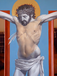
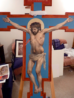
Oct 26 was the delivery date. Here it is riding comfortably in the back of my parents' van, on every blanket we own, and over top of the other framed artwork. Before I call the crucifix finished, it probably needs at least two more layers of color, and when that is dry, I'll finish gilding the frame. After everything has dried for a few months, the last thing I'll do is cover it with a coat of varnish.

November 3, 2013

Crucifix Process 6

I'm long overdue for another update on the crucifix. These photos were taken between Oct 15 and 21, and they outline the entire underpainting process. Making an underpainting in grayscale goes back to the early Renaissance. Not long after oil paints had been invented, painters began to discover that one could paint the values (light and dark shades) of the form first, and then paint thin layers of color over the top, letting the underlying structure show through, and giving the body a luminous, life-like quality. It takes more time and effort than painting the figure alla prima, but the result, I think, is well worth it.


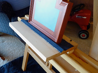
The first thing I had to do was build an extension to my easel, because the supports I screwed to the back made the cross too wide to fit onto it. I just screwed some scrap wood to it, and glued a piece of cloth to it just to give it some added protection. (I'm thinking forward to when there will be gold leaf around the edges.)

I began the underpainting by filling in the light and dark areas I had outlined in the cartoon with solid color, almost like a paint-by-number. When I had the values blocked out, I could then blend them together and refine the form. I painted one area of the figure at a time.


Reference is invaluable. Cloth is especially not the sort of thing that you want to invent when you're working at this scale and level of detail. It has a sort of structured chaos that is very difficult to fake. So even though I didn't have a body of Christ in front of me, I set up a sort of still life and photographed it in a few different lighting situations. I could then pick and choose details from either photo that were more interesting, or that seemed to work best on the figure of Jesus. The end result is much more convincing than it would have been if I had tried painting from my imagination.


The underpainting has to thoroughly dry before I can attempt to start glazing color over it. Every part of the underpainting except for the loin cloth had been drying for four days before I started glazing.

October 19, 2013

Crucifix Process 5

This batch of photos was taken on Oct 11-13. Between this post and the last, I had taken an awl and incised the outline of all the areas that would be gilded. This way I would be able to paint over the pencil lines and still have a clear guide as to where the metal leaf will go. All the areas that will have the metal leaf have to be painted with a red earth tone. Otherwise the metal will look cold and greenish when it is applied. I'm just using acrylic burnt sienna here.


Here I'm applying the acrylic base color for the visible portions of the cross. I pre-mixed a generous amount of this bluish color in a baby food jar, in case I need more of it. It's very difficult to match the same color again if you run out. I applied at least three coats of the blue, being very careful this time not to go over the incised lines.


If I hadn't inscribed the letters at this point, I would have no guide. But you can still clearly see the letters, even though they've been painted over with several coats of acrylic.

Since this is a model, I'm using the composition leaf I have on hand instead of real gold. In order to apply the leaf, I had to carefully apply the size (glue) to only the areas that would be gilded. This particular size has to dry for about an hour before the leaf can be applied. The tricky part was that it took almost an hour just to apply the size to the letters. So I couldn't apply the leaf all at once.


I cut the 5 x 5" sheets of leaf into smaller pieces with a knife on a leather pad. Using a fan brush, I picked up one piece at a time and laid it over the size. After all of the leaf has been applied, the excess needs to be brushed away. I started with a the fan brush, but it eventually required a brush with a bit more stiffness to it.


Afterwards, I repeated the same process for gilding the halo. Cleanup is surprisingly easy. You can just sweep up the loose bits of leaf with a soft brush, and the static causes them to stick to the bristles.

I had planned at this point to continue on and gild the frame and molding, but I feared it would take at least a week to finish, once I had started. I decided to skip gilding the frame until after the art show—finishing the painting is more important right now.

October 16, 2013

Crucifix Process 4

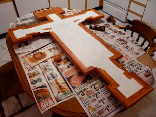
Please forgive another quick photo dump! These photos were taken on Oct 9th and 10th. I redrew the sketch to be more anatomically descriptive, so I needed to make another full-scale cartoon in order to transfer it. Using my ink jet printer, I printed a tiled version of the sketch from Adobe Acrobat, then trimmed and assembled the pages with tape. This is much faster and more accurate than using a grid or a projector, and it costs only pennies.

You can see from the sketch that instead of shading it smoothly, I've outlined geometric shapes that approximate the light and dark areas. The curved contours have also been converted to more angular shapes. This will make it easier to transfer, and will help with the shading in oil paints.


After the drawing is assembled, I laid sheets of tissue paper over it and traced the drawing onto the tissue paper. (You can find large rolls of tracing paper, which works better, but I don't live near any art supply stores, so tissue paper works almost just as well.) Regular paper is too thick to allow pen strokes to transfer through to the graphite paper, so you need to use tracing paper or something very thin.

The cartoon is trimmed for accurate positioning.


I printed the inscription directly onto tracing paper, to
save a step. You can see the graphite paper underneath.


The drawing is completed after I outline the edges of the
gold leaf, which extends into the cross an extra .75 in.